Aria
B2B payments made to be easy
Aria takes the pain out of payments and puts the action into transactions. The Paris-based fintech startup asked us to come up with a radiant connected brand system and a website that would take their B2B payments platform from complex to compelling. Mais bien sûr.
B2B
SaaS
Fintech
Fueling Frictionless Finance
The Idea: To make business payments flow as smoothly as consumer transactions. The Solution: A deferred payment infrastructure offering flexible financing options for B2B service marketplaces and transactional SaaS platforms. Fueled by a €15 million Series A round led by European fintech investor 13books Capital, Aria’s single-minded founders, Clément Carrier and Vincent Folny, came to us poised to turn their ambitious vision into reality.
Born Digital. Built to Perform.
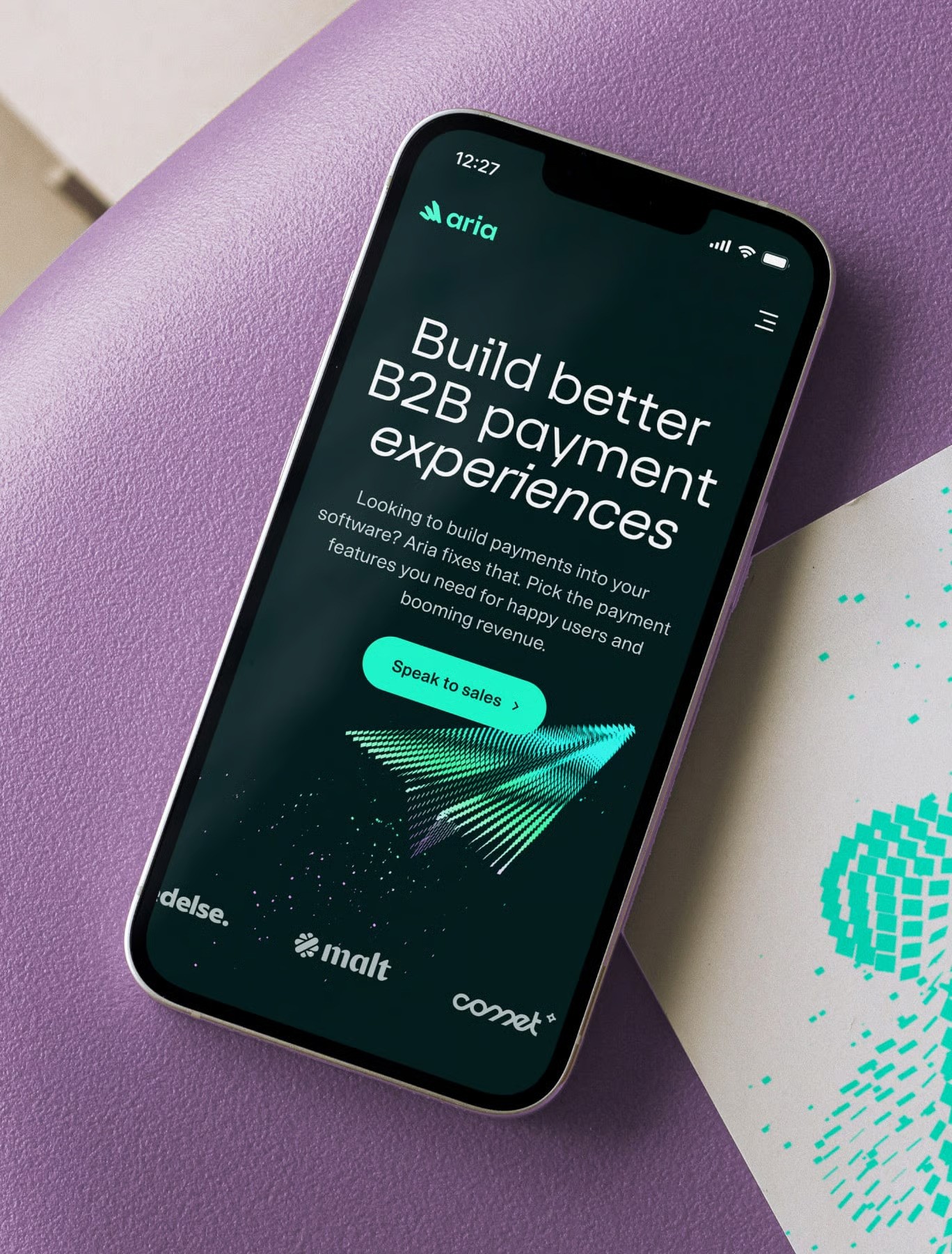
Bringing Digital-First Vision to Life - We built Aria a brand that lives where it matters most — online. Digital-first, instantly usable, and made to work hard across every touchpoint.
Lightweight. Cohesive. Ready to Go.
Like many early-stage tech startups, Aria prioritized practicality and speed over exhaustive brand guidelines. Instead of a thick and static brand manual, our focus was on creating a flexible, digital-first identity — one that could be immediately deployed across all touchpoints. Together, we built a connected digital brand system that is purpose-built for screens, designed to feel cohesive and dynamic across both the website and product interface from day one. The result is a brand that’s not only visually refined and consistent, but also ready for real-world application — adaptable, scalable, and inherently digital.

Core Creative Concept
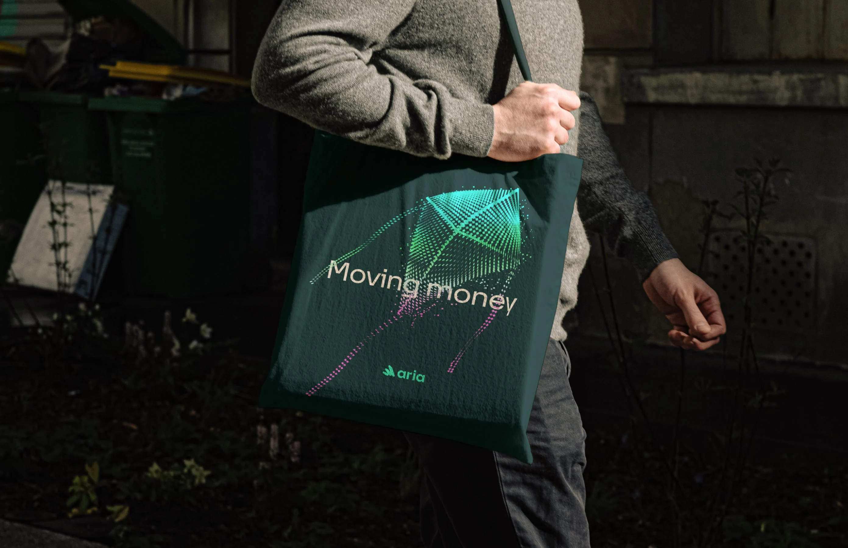
CoreThe brand system is built around the concept of the flow of digital money — fluid, seamless, and technologically sophisticated. At its center is the electric green “Kinetic Square”, the brand’s foundational visual element. It symbolizes a single digital transaction that transforms into dynamic, fluid patterns, capturing the sense of continuous movement and energy, even in moments of stillness.
Illustrating Personality
Directly connected to the broader visual language, the illustration style bridges metaphorical and literal expression. It’s distinctive, adaptable, and instantly recognizable, reinforcing the brand’s personality while maintaining visual consistency across all applications.
Visual System
Four key visual devices — Kinetic Square, Texture, Supergraphic, and Illustration — enable Aria to adapt and express its brand across a wide range of contexts, from the highly functional to the deeply expressive. This flexible system ensures visual coherence while allowing creative freedom across different touchpoints.
Brand Identity
Aria’s logo originates directly from the Kinetic Square, with its animated form drawing inspiration from the more expressive Supergraphic. This connection reinforces continuity across the brand system, uniting motion, form, and expression into a cohesive visual identity.
Type in Motion
Aria’s primary typeface, 37 Lineca, is structured and precise, striking a balance between technical sophistication and approachability. Its modern, tech-driven character complements the brand’s expressive illustration style. For body copy, the highly legible STK Bureau Sans provides clarity and ease of reading, ensuring functional communication without sacrificing visual harmony.
The Colour of Money
Aria’s colour palette draws inspiration from the world of physical currency, reinterpreted through a digital lens. A surge of electric green energizes the system, adding vibrancy and modernity while reinforcing the brand’s connection to movement, technology, and value.
Capturing Emotion
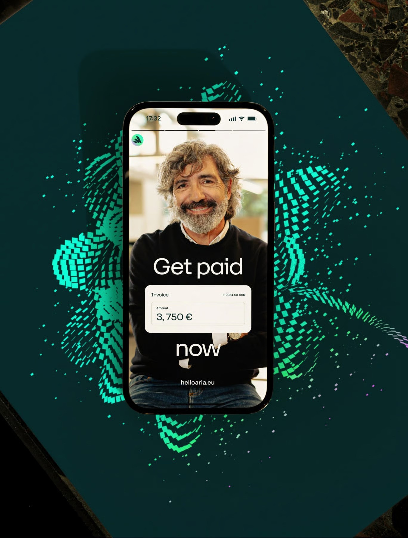
With high flash and warm color grading, Aria’s photography captures moments of real human energy — fleeting expressions, candid gestures, and raw emotion. This approach adds warmth and humanity to the brand’s otherwise electric, digital aesthetic, creating a visual tension that feels both alive and authentic. It’s the human pulse behind the flow of digital money.


System in Motion
Aria’s website brings the brand system to life, showcasing lively motion graphics and interactive elements that express the idea of money in motion. The design is clean, confident, and intentional — balancing clarity with energy. Every detail, from animation timing to visual hierarchy, works together to create an engaging, story-driven experience that feels both human and high-tech.
From Motion to Interaction
In the past, showcasing product features on a marketing site often meant relying on linear, pre-rendered videos. Today, Rive animations change that entirely — allowing motion designers to build interactive product moments that feel alive and responsive. On Aria’s website, these interactive miniatures give visitors a hands-on sense of the product, transforming static storytelling into real-time engagement.
Invisible Touch
Bringing iridescent motion graphics into the website’s visual system was no small feat. Balancing their shimmer and movement with other on-screen elements required careful experimentation. Thanks to our developers’ smart use of transparent video formats, the integration feels seamless and effortless — a layer of invisible craft that most visitors will never notice, but everyone will feel.
Explaining Complexity, Beautifully
Branded user interfaces help tell Aria’s story from the inside out — showcasing the features and benefits of its product through purposeful, narrative design. In this instance, the UI highlights and demystifies Aria’s white-label API solution, turning a complex technology into a clear, intuitive visual experience.
Where Money Moves, Business Flows.
Special thanks to Clément Carrier, Pierre-Antoine Bauduin, Tsanta Rabemananjara, and the entire Aria team for their collaboration and creative partnership.